We Digital Interns have lived and breathed accessibility for the last couple of months. If you were to ask any one of us for advice on how to make a document accessible, we could give you a bucket load of tips. It has now become second nature for us to use refinements to make our reports and presentations 100% accessible.
However, most of us continue to bash out an email on the keyboard without considering our dyslexic friend, or how it will translate to audio for the partially sighted students in our cohort.

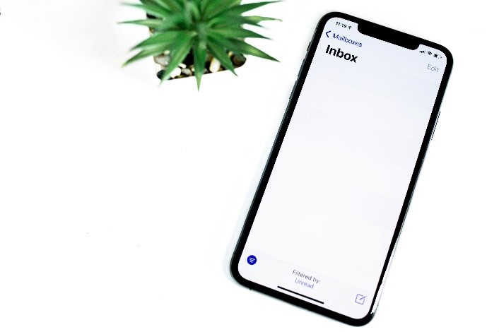
The fact is, it’s easy to make a couple of quick enhancements to the email template to ensure that all emails follow basic accessibility principles. Giving equal thought to formatting an email as you would to a Word document is crucial. For example, using heading structures and detailed alternative text when adding an image helps the partially sighted person understand the context of the document.
Outlook offers the same accessibility features as other Microsoft products; a few seconds spent checking will ensure your important content is actioned by readers. There is nothing worse for a dyslexic than being faced with lines and lines of text. They seem to mingle into one and become over facing, so keep emails succinct and to the point. Less is more.
Here are some helpful tips to remember when composing an email:
- Use clear fonts
- Use a larger font size (12+)
- Use 1.5 line spacing
- Format your email consistently
- Add alt text to your images
- Avoid image only emails
- Make sure it is consistent, defined and easily digestible
- Check the colour contrast using WebAim
- Use the accessibility checker before sending
Take a look below at some further ways in which you too can now ensure that your emails are fully accessible, taking into consideration important aspects such as colour contrast levels, using a digital signature and adding alt text to images/screenshots.
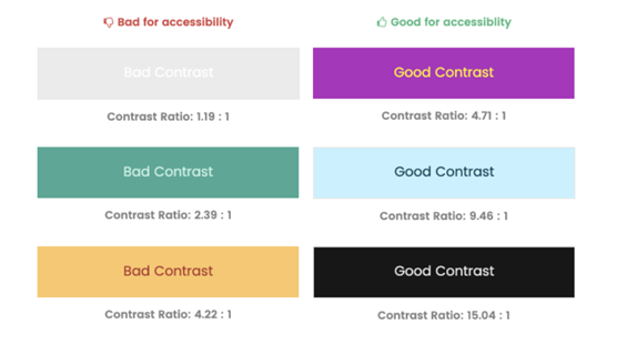
Poor Contrast Levels
A common mistake is using poor colour contrast. If you need to use colours within the email then you check out the contrast on WebAim, ensuring that it is fully accessible.
Built-in Signature
Finally, using the built-in signature feature to add a few refinements can help spread the message throughout the Edge Hill community. Why not add a line on the importance of accessibility to your email signature?
How about adding a link to this easy to follow “how to” document, so others can join the accessibility club?
For more information about accessibility staff can visit the following wiki pages – https://go.edgehill.ac.uk/display/ls/Accessibility
Students can also visit our Build Accessible webpages to learn more about accessibility – https://www.edgehill.ac.uk/ls/onlinelearning/build-accessible/
By Paula Garlick (Student Intern)
One response to “The key to email accessibility”
This article provides great insights into using headings for better navigation, but how can we encourage more people to adopt this practice consistently? Regards Telkom University Jakarta