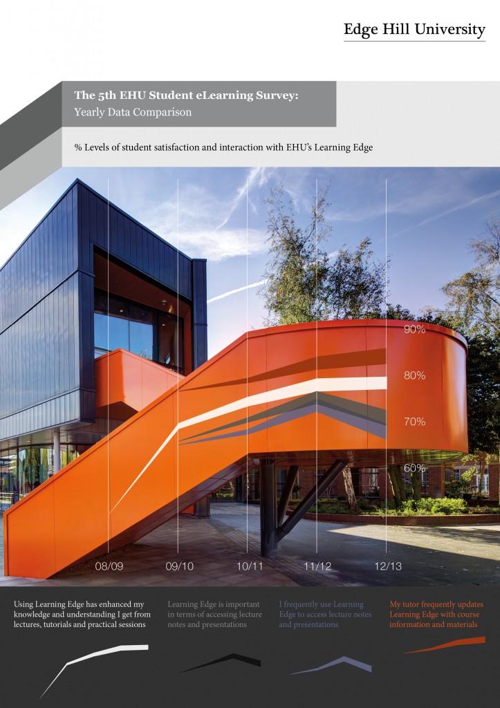
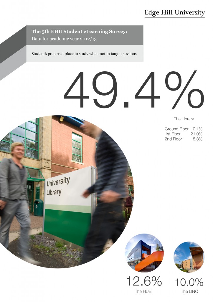
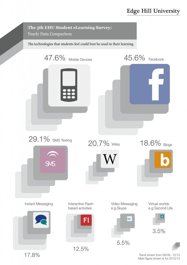
The 5th EHU Student eLearning survey closed in the spring of this year and we will be sharing the full report and feedback shortly, but we wanted to highlight some of the headlines using infographics. Using pictures to tell a story is nothing new but we have been looking over the past few months at how we can represent research data in an infographic. We can see many opportunities for communicating to our customers the messages from what in the past, they might have seemed like dry or complex data. Seeing the trends, figures and statistics which are contained in research can be really hard sometimes but the infographic brings the message to the foreground in a visually appealing way. Using a graphic can also very easily give your statistic some context, again, something which can be hard when you are writing a report.
A key element of the annual eLearning survey is seeing the trends in terms of the use of TEL and the VLE and also the technology the students are using to access learning.
Here are 5 infographics showcasing the following; the increase in student satisfaction and interaction with Learning Edge; personal means of accessing the internet (we all know where that one is going!); preferred place of study on campus – it is still the library but we will be tracking in future how students are using our new student HUB; the technology students feel could be best used in terms of their learning; and bringing us back to our campus and the facilities, the increase in students using wireless on campus.
We hope you find these graphics more appealing that just a percentage statistic and we will be sharing more technology and Learning Edge data soon, along with some library statistics so if we can excite people about book issues by using graphics, it’s a result!
Rachel Bury
Academic Liaison Manager – Quality, Marketing and Communication


